Friday 26 June 2015

Responding to Comments and Feedback

With My Animation Now being Uploaded to YouTube, i have been able to receive Comments and Feedback from People who have taken the Time to Watch the Video. I have Received a grand total of 4 Comments on the Video via the YouTube Comment Section. I will Respond to them in this Blog Post rather than replying to each one individually. You can watch my animation here.

First i will give my own Personal Opinion of the Animation and then i will assess the  comments and respond to them accordingly.


Personally, i feel that my animation turned out a little better than expected. I didn't think it would turn out half as good if i'm being totally honest. This is mainly because although i knew that the animation itself only needed to be around 20 Seconds, i felt that it would turn out a little bit too rough and would look a little rushed. However, when selecting music and sound effects, i feel that i made a good choice, and that the music added more to the Final Product then i may have anticipated. I can't deny that it still does look a little rough and i am more than aware that if i had allocated myself more time on this particular project, it could have turned out to be a lot better aesthetically i mean.


Here are the Four Comments i have received on the Video Since it was Uploaded.
I feel that all of the comments are generally positive, but also have some fair criticisms. I am glad that people are saying that they enjoyed it, and i am very pleased with how people have noticed the music and how it seems to fit quite well. I think that the Comment by the user, 'Eclipse GP' may be a little too generous, because in my opinion, it doesn't look exactly professional, as it is too rough around the edges and could certainly use a bit of improvement in terms of it's appearance as i mentioned earlier. This issue being pointed out by the user, 'TheNinjaHitman', his comment saying that he enjoyed the animation and music, but could clearly see that the background images could have been better, and could have been more aesthetically pleasing.  

One other criticism i received was that the sound of the Chicken was a little irritating, because it was seemingly non-stop, and as time went by, it just got a little annoying. I can understand this and even thought about it while editing the sound. But i kept the Sound effect in because i thought it sounded quite funny. But again can understand the criticism, and will make sure to take it into consideration next time i add sound effects for humor,  and maybe ask for a second opinion when doing something similar in the Future.

So although the general consensus is that people enjoyed the animation, i am more then happy to take some criticism, if it means i may create a more likeable animation in the future. In the future i will also try and allocate myself more time when trying to be creative or when i know something could have some potential to be really good, if all i need to do is spend a little more time with specific aspects of the planning and creating processes.

At the moment, even though i would like to, i can no longer make any improvements due to time constraints. but again, i will definitely take this as a learning experience to hopefully create a better animation in the future as well as getting myself to set aside enough time to be able to create something to the best of my ability.
This has been a similar issue in the past for me when trying to create an animation. Both time constraints and the end product not looking quite as good as it maybe should have. You can see this in my animation i created a little over a year ago by viewing it below.


I feel that i can improve on both of these animations and hopefully in the future, i will create something i know is genuinely good and something i can be very happy with. 


Tuesday 23 June 2015

Animating (Finally!)

Today i have started and completed my animation. It didn't take too much time to actually animate because there isn't an awful lot of movement going on and i am only using the one set.


 This photo is of the set. I used some Grey coloured card as the floor and some Light Yellow Coloured Card as a back-drop so that you could see a printer which is sitting just behind the 'set'.


In this photo you can still see the set but you can also see part of the Webcam used to film the animation and part of the computer screen which is displaying what the camera is seeing.


The Software i used to capture each frame is called iStopMotion 3. It is a basic piece of software, but it gets the job done.


This is a screenshot of the Software while i was using it. I captured this animation in 12 Frames Per Second, that means that every second that you watch of the final product, will consist of 12 separate Photographs.


You can watch the Final Animation Here.


Sunday 21 June 2015

Creating and Building.

At first i wasn't sure as to how i would make the chicken look. I thought to myself, 'how can i make a chicken look funny?' Aside from him walking into a KFC Styled Restaurant.

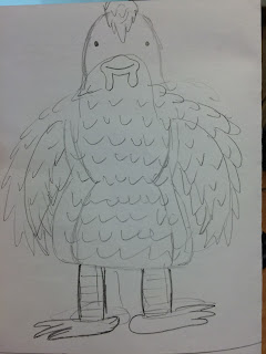
First i drew the chicken on paper at a front facing view and a side facing view. This was i understood some of the proportions that may be needed when creating he Chicken out of Modeling clay. I figured that if i drew it first i might be able to get a sense of whether or not it was actually possible to make out of clay and still be effective. here are those drawing below.


The one which has the text, 'Kentucky Fried Children' written non it is supposed to be the chicken version of Colonel Sanders, the Face of KFC. Can you see the likeness?


After drawing them out, i decided that it might be a little too far fetched for me to try and create a realistic looking chicken. So i thought, 'This is like an alternate universe where chickens Eat people, so why would it be so wrong for the chickens to wear clothes?'

So with this i decided it would look cool if the chicken was wearing a suit. Here is the Photo of the Suit i created Below:


I am quite happy with how the suit turned out, you will get a better look at it in the following Photos in which you will see the chicken's head.


Just to add, i made the body after i made the head, but due to the way i have set out this post, i have shown you the body first.


Here is the chicken's head. I know that it looks a little plain at the moment but it is still subject to change.


I think at this point i will change the head if i think i can make it more 'funny looking'. I just don't think it looks as good as it can be at this moment in time.


I have also added a little Tail of feathers at the back. I'm not sure what it is called exactly.
Here is the Head attached to the Body.


I will now begin Making the Wings/arms of the Chicken, this is because in the animation he will need to hold a small bucket of Deep-Fried Human Arms and BBQ Human hands etc.

In the mean time i have decided to remake the head because i knew it could be better. Plus it had gotten dirty and wouldn't clean properly.


I made the eyes a bit more wide apart because i thought it would give the chicken a more 'gormless' appearance. i have also added the little floppy bit on top of the chickens head.


In the meantime i will scan in the drawing of my version of the KFC Logo and colour it in using Adobe Photoshop.

I will Now Smooth out any little rough areas on the logo and then print it out to begin building the set.
I have collected some red coloured card and a card board box so will now begin making the 'set'. 


I will take the lid off of the cardboard box and will begin putting it all together so i can hopefully (eventually) begin animating soon.


Here is a window i have quickly made in Photoshop. This will be placed onto the red card.


Here is the complete set all finally built.


And just for good measure, here is the chicken holding his KFC Bucket (below).


In My Next Blog Post, i will begin Posting updates from the actual Animating Process.